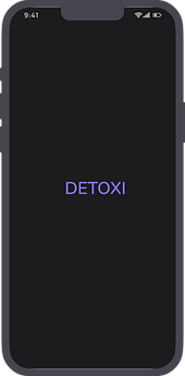
Detoxi
Minimalist, dark-mode interface, Detoxi encourages users to disconnect from their devices by tracking their usage patterns and offering rewards for achieving detox goals
Project type
Personal Project
My Role
UX / UI Designer
Duration
2 weeks
Tools
Figma
*To facilitate the user experience, I have emboldened the "how" (methodology), and highlighted the "why" (reasoning / goal).
The Problem
Users find it difficult to reduce screen time and manage digital distractions, affecting productivity and well-being.
The Solution
Detoxi helps users reduce screen time by offering personalized goals, reminders, and progress tracking for better focus.
User Research + Pain Points
In Detoxi, I focused on individuals seeking to reduce screen time and improve their digital well-being. The primary user group includes young professionals and students struggling to balance their digital habits.
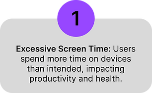
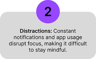
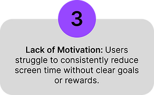
The research revealed key pain points, such as excessive screen time, distractions, and a lack of motivation to detox. This information guided the app's design toward simplicity, habit-tracking, and personalized reminders to support healthier screen habits.
User Persona
The research collected previously helped create user personas, which would be used later to lay the groundwork for the iterative process and help inform design decisions.

Problem Statement + Ideation
The work done previously to empathize with the user helped to define the problem and come up with a problem statement for our persona;
' Umar Ashfaq needs a simple and effective way to reduce screen time and improve focus without feeling overwhelmed, allowing him to balance productivity and relaxation.'
For ideation, I used the "How might we" method to brainstorm ideas quickly for possible solutions to common user problems. The following questions were formed:
How might we
-
Mntegrate real-time notifications for users to take breaks or unplug from devices?
-
Make screen time management feel rewarding and less like a restriction for users?
-
Create a user-friendly interface that encourages consistent engagement with the app.
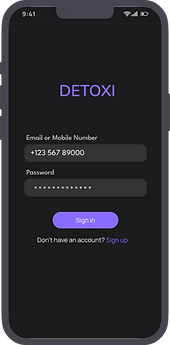
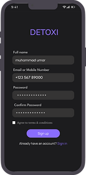
High-fidelity mockups
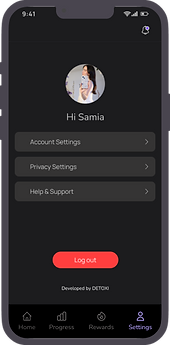
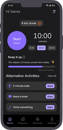
Set your daily screen time goals and start tracking


Monitor your screen time and watch your progress grow
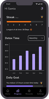
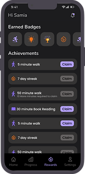
Earn rewards and achievements as you reach your goals
Get personalized reminders to take breaks and stay mindful.

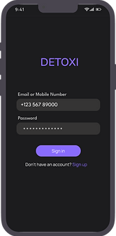
Clickable prototype
The clickable prototype has been provided here for an understanding of the app navigation;
-
The app here is just a demo version, so it has a few sample screens, and not all the buttons can be clicked.
-
Click on the blue highlighted regions if you are unsure what to select.
-
The screen can be enlarged by pressing on the full-screen icon at the top right corner of the prototype.
Accessibility Considerations
-
Consistent visual hierarchy enhances scannability, guiding users to essential content quickly and efficiently.
-
High contrast between text and background ensures readability, adhering to the principle of visual clarity.
-
Large, tappable buttons improve touchpoint accuracy, enhancing usability for diverse user needs and devices.
-
Simplified navigation follows the 'Recognition Over Recall' principle, reducing cognitive load for all users.